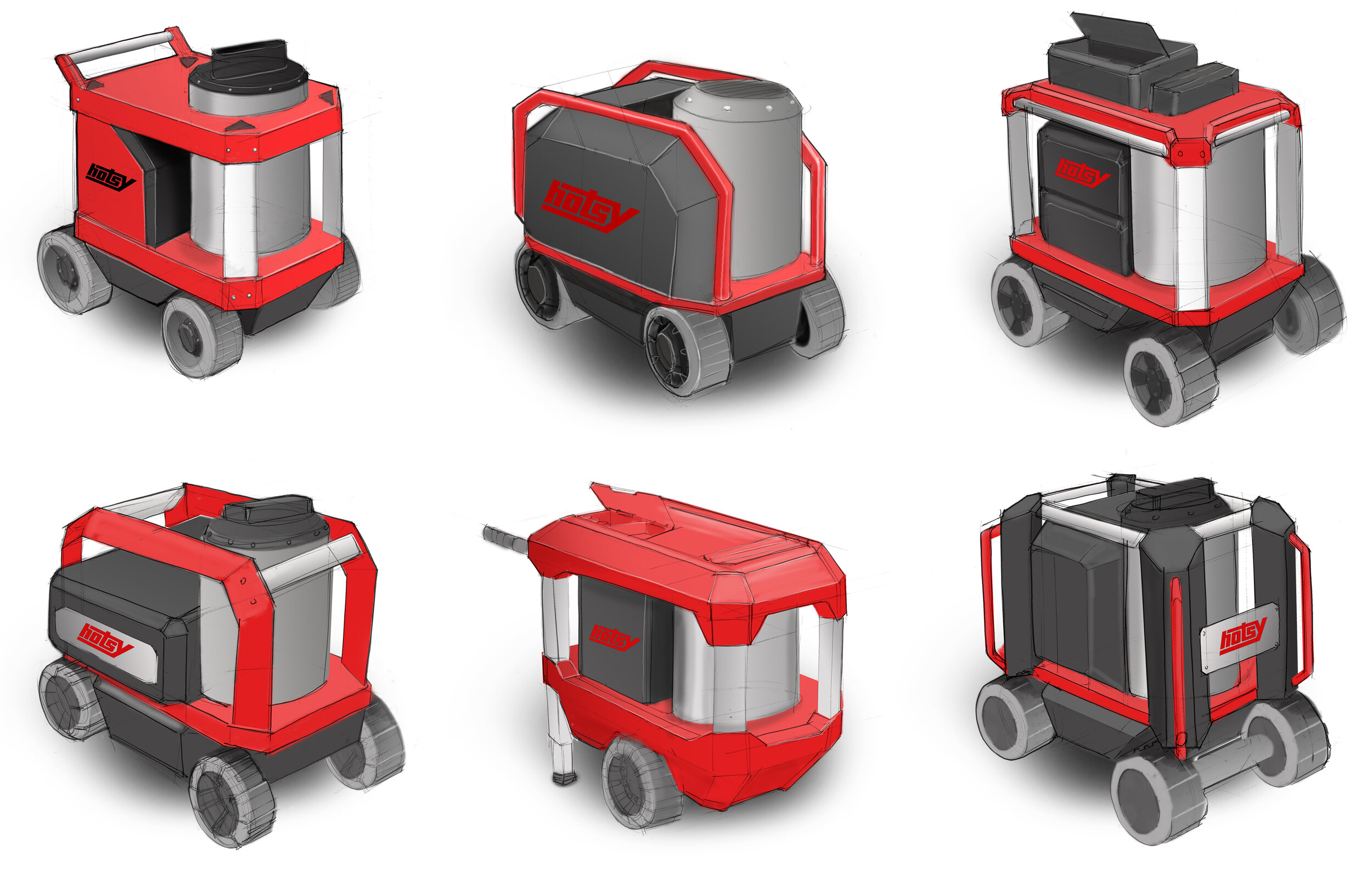
Hotsy 555 HE

Situation
The design of the 555 was 20 years old and in need of a refresh.
The brand was strong and had a lot of equity and yet the dealers did not want to change the design of the 555.
Objectives
Redesign a classic
Make the hot- water mobile pressure washer that is more modern and efficient yet still holds fast to its roots.
Descriptors
Rugged
Robust and burly aesthetic that looks like you could drop it off the top of a building.
Utilitarian
Open and honest aesthetic that embraces the customers desire to modify and customize their pressure washers.
Geometric
Simple and confident shapes that are not complex or showy.
Chiseled
Angular profiles and beautiful finishes like a modernized hotrod
Sketch It
As a team we got together and sketched for hours to come up with what we felt were good solutions to the evolving the Hotsy 555. We narrowed them down to the six designs that are above and I rendered them in Photoshop. This allowed us to share our ideas with product management and the dealers
Results
In the end the design was closer to the original than we had planned but it has a nice modern feel to it and the new tower makes it look very confident and robust.
Ultimately the dealers loved the new design and this helped them embrace the new efficient boilers that they did not want at first.


